The Psychology of Color in Home Decor
Colors are more than just visual elements in your home—they have the power to influence your emotions, behavior, and overall well-being. Understanding the psychology of color can help you make informed decisions when decorating your home, ensuring each space enhances your mood, productivity, and relaxation. This article will explore how different colors affect your mind and offer practical tips for incorporating these colors into your home decor.
1. Understanding the Basics of Color Psychology
Color psychology is the study of how different hues impact human emotions and behavior. While reactions to colors can be subjective and influenced by cultural factors, certain generalizations can guide your choices in home decor. Here’s a quick overview of how some common colors affect mood:
- Blue: Calming and serene, blue is often associated with stability and tranquility. It’s an excellent choice for bedrooms and bathrooms where relaxation is key.
- Yellow: Bright and cheerful, yellow can boost energy and creativity. It works well in kitchens and home offices where you want to stimulate mental activity.
- Green: Symbolizing nature, green is refreshing and balancing. It’s ideal for living rooms and other communal spaces where you want to create a sense of harmony.
- Red: Bold and stimulating, red can increase energy and excitement. It’s best used in moderation, perhaps as an accent color in dining rooms or entryways.
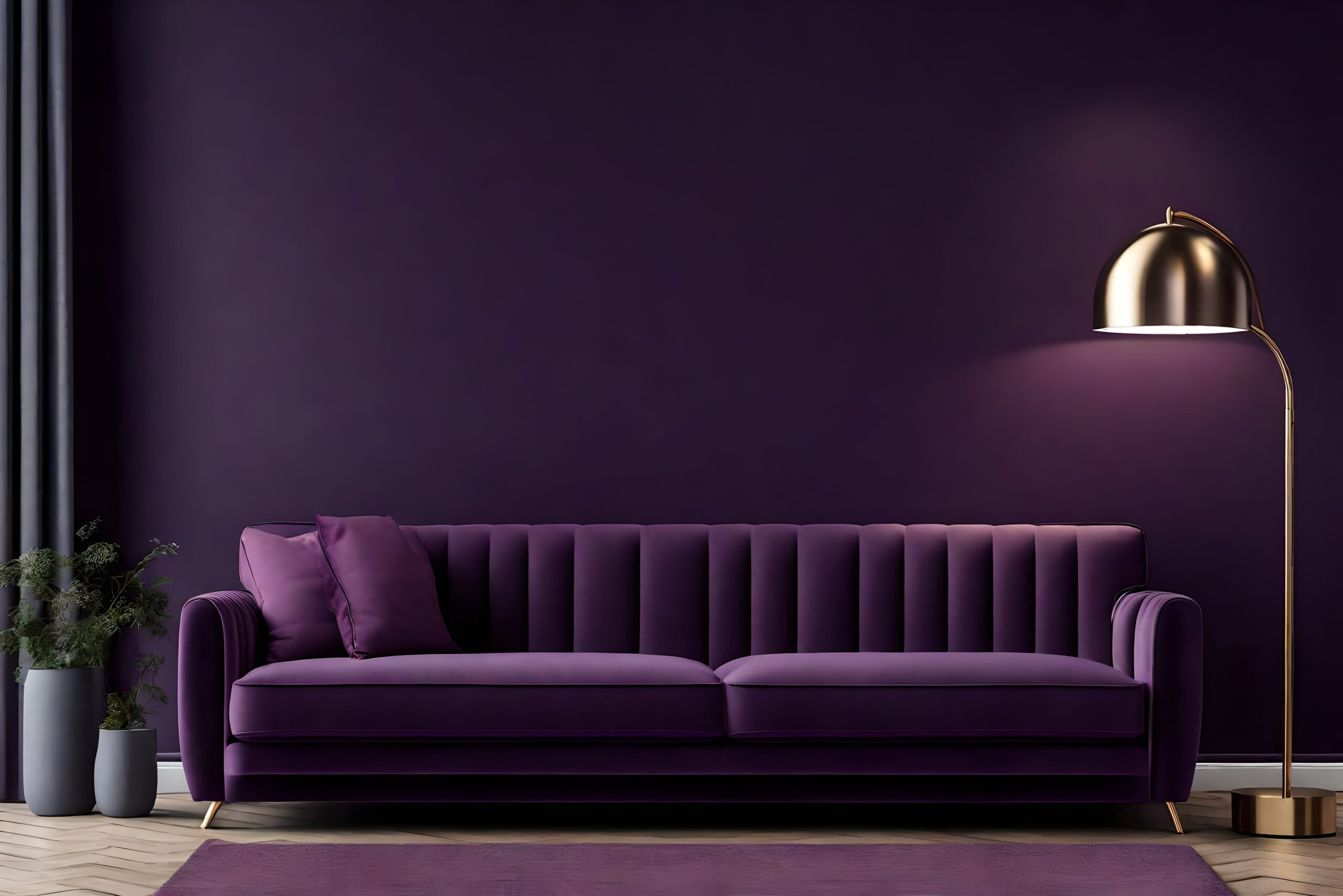
- Purple: Often associated with luxury and creativity, purple can evoke a sense of sophistication. It’s a great choice for bedrooms or creative spaces.
- Neutrals (White, Gray, Beige): Neutrals provide a versatile backdrop that can either calm or energize depending on the shades used and the colors they’re paired with. They’re perfect for any room and can be easily updated with colorful accessories.
2. Choosing Colors for Specific Rooms
Each room in your home serves a different purpose, and the colors you choose should reflect the mood you want to create in that space. Here’s a guide to selecting the right colors for various rooms:
Living Room: Creating a Welcoming Space
The living room is a place for relaxation and socialization. Warm, inviting colors like soft greens, earthy browns, or warm neutrals can create a comfortable atmosphere. If you prefer a more vibrant space, consider adding pops of color with throw pillows, rugs, or artwork.
Tip: To add depth and interest, try an accent wall in a bold color like deep blue or rich mustard, balanced with more neutral tones in the rest of the room.
Bedroom: Fostering Rest and Relaxation
For a restful retreat, choose calming colors like pale blues, soft greens, or lavender. These colors promote relaxation and help create a peaceful environment conducive to sleep.
Tip: Incorporate these colors through bedding, wall paint, and curtains. Add texture with soft, cozy materials to enhance the soothing vibe.
Kitchen: Energizing the Heart of the Home
The kitchen is often the busiest room in the house, so opt for colors that boost energy and creativity. Bright yellows, warm oranges, or fresh greens can invigorate the space and make it feel lively.
Tip: If you’re hesitant to commit to bright walls, consider using these colors in accents like backsplash tiles, kitchenware, or bar stools.
Home Office: Enhancing Productivity and Focus
In a home office, you want to strike a balance between energy and calm. Light blues, greens, or even muted yellows can enhance focus and creativity without being overwhelming.
Tip: Use these colors in your office furniture, wall paint, or decorative items like bookshelves and desk organizers. Pair them with plenty of natural light to create an inspiring workspace.
Bathroom: Promoting Calm and Cleanliness
Bathrooms are spaces of renewal, so cool colors like soft blues, greens, and crisp whites work well. These colors evoke cleanliness and tranquility, making your bathroom a relaxing escape.
Tip: Complement the serene color palette with natural materials like wood and stone for a spa-like feel. Consider soft lighting to enhance the calming atmosphere.
Dining Room: Stimulating Appetite and Conversation
Rich, warm colors like red, terracotta, or deep browns can stimulate appetite and encourage conversation, making them perfect for dining rooms.
Tip: Use these colors on walls, table linens, or dining chairs. If red feels too intense, consider using it as an accent in artwork or a feature wall.
3. Practical Tips for Incorporating Color into Your Decor
Incorporating color into your home doesn’t always mean a complete overhaul. Here are some practical ways to add the right hues without a major renovation:
Start Small with Accents
If you’re hesitant to commit to a bold color, start with smaller accents like throw pillows, rugs, or artwork. This allows you to experiment with different colors and see how they affect the space.
Use Color to Define Spaces
In open-plan homes, color can help define different areas. For example, use a calming blue in the living area and a vibrant yellow in the kitchen to create a natural transition between relaxation and activity zones.
Balance Bold Colors with Neutrals
When using bold colors, balance them with neutral tones to avoid overwhelming the space. For instance, if you choose a deep red for your dining room, pair it with neutral furniture and accessories.
Consider the Lighting
Natural and artificial lighting can significantly impact how colors look in a room. Test paint samples on different walls and observe how they change throughout the day before committing.
Personalize Your Space
While color psychology provides general guidelines, your personal preferences should guide your choices. If a certain color makes you feel happy and comfortable, find a way to incorporate it into your home, regardless of the “rules.”
4. Expert Insights on Color Psychology
Color psychology experts emphasize that while colors can influence emotions, the effects can vary depending on individual experiences and cultural contexts. According to Karen Haller, a leading color psychology specialist, “Color is a powerful communication tool. It can be used to signal action, influence mood, and even influence physiological reactions.”
Haller suggests that the key to choosing the right color for your home is to consider how you want to feel in each space and to use color to create that emotional response.
Conclusion: Transform Your Home with the Power of Color
The colors you choose for your home decor have a profound impact on your mood, productivity, and overall well-being. By understanding the basics of color psychology and applying them thoughtfully to each room, you can create spaces that not only look beautiful but also support your emotional and mental health. Whether you’re creating a calming bedroom, an energizing kitchen, or a productive home office, the right colors can make all the difference.


